
 skip to main content
National Flexible is under no illusion that in most cases final pack presentation will "sell" the product to the consumer for the first time.
That's why we offer a full pack graphic design package as well as free cutter guides and layout service as part of our pre- press technical support package.

“We have achieved a position in the marketplace that communicates Global Bounty’s ethos of offering consumers a wholesome and healthy alternative to everyday oat brands.”
Suresh Patel, Director of Global Bounty
The Brief
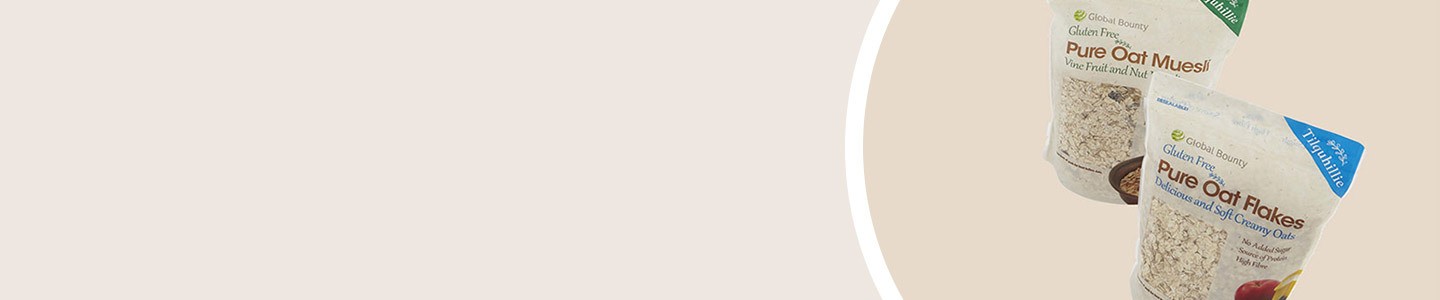
Global Bounty’s team had a desire to take their brand to the next level by requesting a more retail-friendly package design with a firm brand identity.
The end goal was to re-brand Tilquhille Oats and visually elevate the brand positioning to consumers of a very niche, but rapidly expanding Gluten Free category.
During the start of the process there were clearly a few things the concepts stage must consider:
- Gluten Free messages & secondary messages
- Showcasing the high quality of the natural oats
- The target market audience
- The design should communicate approachability to the consumer
- A matt finish vs. gloss finish
- A final design that could reduce printing plate costs across the range
"As a niche brand, the relaunch design helped boost sales and buyer interest across our range.”
Suresh Patel, Director of Global Bounty
Conceptual Stage
Many projects of this scope require some visually brainstorming.
We started with examining some similar brands in the marketplace and the visual language they use to communicate to their target consumers. At this time, the category leaned towards the female over a male audience. We pulled trends and assembled mood boards to create a visual positioning that would be unique to Global Bounty. We presented several different and various design routes that could solve the brief. The team at Global bounty choose to move forward with the Pure Goodness design concept.
Mock-Up Stage
Once the first stage of the design was developed onto the cutter guide we produced digitally printed mock-ups. This enabled The Global Bounty team to view a potential "final pack" whilst still at the conceptual stage.
Final Touches
Now complete with a "clean" brand allied with typography that expresses a feminine approach, the new range reflects an appreciation for purity inspired by nature. The well positioned window showcases to the consumer the high quality of the ingredients.
The final paper effect tactile lacquer finish creates a soft to the touch feel which assists in driving home the message of a premium product.